Hyperlocal maps show dramatic variations in Oakland's air pollution
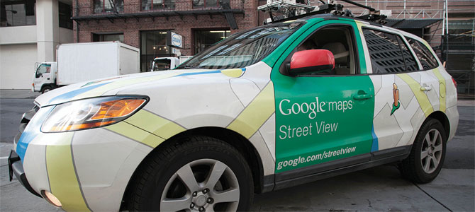
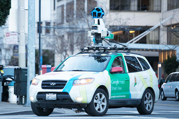
Video: Google Street View cars equipped with Aclima's environmental sensing platform measured black carbon, nitric oxide, and nitrogen dioxide.
For our first air quality mapping project, we wanted to learn just how much air pollution can change within local neighborhoods. EDF convened a diverse group of partners to harness the latest mobile sensor technology, and collected data showing air pollution can be as much as eight times higher at one of end of a city block than another.
Specially-equipped Google Street View cars drove through sections of Oakland, California, where there are three stationary, regulatory-grade air quality monitors, collecting air pollution data. EDF served as the scientific lead, while engineers from the University of Texas at Austin worked closely with Aclima to map and measure and analyze the pollution data.
West Oakland interactive map »
We know West Oakland has poorer health indicators than some nearby areas. Our research helps explain how air quality impacts health.
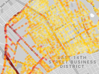
East Oakland interactive maps »
Explore levels of three pollutants, and you'll see that busy roadways and commercial and industrial facilities contribute to elevated air pollution.
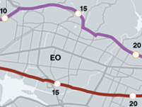
A tale of two freeways »
The I-880 freeway has much higher levels of pollution than the I-580, exposing people who live nearby to differing levels of health risk. Why?


